Tuesday 29 September 2015

Masthead designs


 1.) If i were to recreate these more professionally i would want to use a font that look very hand written, so it would look as if students had made it. PB would be in bold and maybe a more professional font to stand out from the rest. i decided to use black and red because they are the school colours which we associate with the school to make it feel as if the magazine would be more anchored to it. the tag line i went with a saying that i always hear, people are always saying and i agree that school feels like it's going really quickly, and i thought it would be appropriate.

2.) I would use fonts that have a more professional look, for "plants brook" i would want to use a font that is curvy and flowing, while "magazine" and the tag line would be in blocky fonts to show a solid structure, the tag line i decided to use was as reference to through out secondary school we are always told we will need to take more responsibility for ourselves.

3.) I think the inclusion of the school logo would be a good feature because it gives a sense of belonging, the title "school informative" i thought would be a good idea as it give an overall feeling, as in it's for the entire school not just students, or parents. i used a rhetorical question for the tag line as i thought it would make people more interested while also saying what the magazine would tell you.

Tuesday 22 September 2015

School magazine mastheads


The first masthead has what i assume to be the initials of the school before the magazine title, saying where the magazine is from, the font is informal and almost like handwriting. the second masthead makes it out as if the magazine is aimed more for the parents of the students, and what they can do, the font is more formal looking and simple, the last has bright colours on it but a font that looks half way between formal and informal, suggesting that it is aimed at and for maybe both parents and children to enjoy, 

Thursday 17 September 2015

Helpful items

Helpful items:

The first site I used was TubeChop, I found it incredibly easy to use. After fiddling around with it for only about 5 minutes I started to understand how to do things and even managed to figure out how to add the "chopped" video into a blogger post! Although I had to search how to embed the clip, it didn't take long until I found out through google.
The site's layout is simple and easy to figure out. I especially liked how there was the bar that you could move with your mouse to get about in the right area to chop the video but the fact that they also had a box for start and end time where you can type the times in to be more accurate, one of my favourite features is that it can be used for free and without an account making access to it a lot easier. Over all the site is incredibly easy to use, and I am very glad that they put both the embed code and the link url after you have chopped a video. I can see this becoming very useful if i have to use youtube videos on my blog, although it does only work with youtube videos, so if there is a video from any other site it might become a problem.


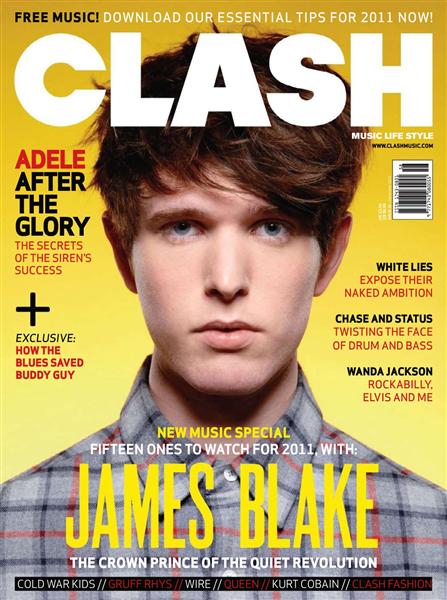
Music magazine covers


Music magazines
  • all covers have only one musician on
  • most of the covers the person is looking directly at the camera
  • most of them aren't smiling
  • each cover has the musicians name bold and visible (anchorage text)
  • mastheads are all at the top of the cover
  • the text comes around or over the musician
  • the ladies are all wearing makeup 
  • all have plain backgrounds, most grey white or black